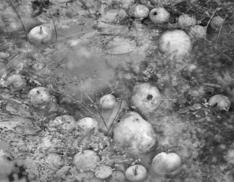
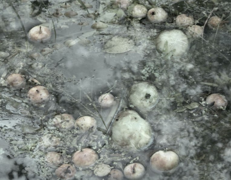

Wild apples floating in the creek, doubly exposed and ‘cooked’ three ways. (I think I like the black and white…) It seems the deer come to this hidden place to bob for apples, leaving behind deep footprints in the clay banks.
© Karen McRae, 2013

Wild apples floating in the creek, doubly exposed and ‘cooked’ three ways. (I think I like the black and white…) It seems the deer come to this hidden place to bob for apples, leaving behind deep footprints in the clay banks.
© Karen McRae, 2013

I love them all but I think the soft greens in photo three are calling to me at the moment. 😉
Ah, I couldn’t decide …but I imagine the deer prefer them in colour, too. : )
Thanks, Cynthia!
Oh, Karen – I just love the visual image of the deer bobbing for apples! And, I think you did an excellent job with these three images, letting the color gradually appear.
I’d love to capture a photograph of them bobbing for apples, I’m not stealthy enough, though… ; )
Thanks very much, Melinda. This was my solution to indecision!
Great idea to double expose the pond of apples. Makes them look dreamy and out of a different world – or maybe just wild. I actually think I like the last most colourful the better. It’s something with the definition of the apples – and of course the few colours themselves – that attracts me.
Hi Otto, thanks for your thoughtful feedback, it’s much appreciated.
I always find your double-exposures to be so compelling…they provide so much substance to think about photographically, artistically….etc and etc. Very nice, Karen.
I’m glad to hear that because I find the need to keep experimenting with this type of photography. I like the unexpectedness of it and also the possibilities when something seems to be working.
Sincere thanks for your words, Scott.
You are most welcome, Karen…your work is such an inspiration and it’s been fascinating to watch your projects develop…the wrapped trees in the winter fields, the seed-heads and ice…etc, etc….. 🙂
Enchanting.. I have no idea how you do the double exposure thing unless you mean you are combining/layering 2 photos in photoshop?? is that what you mean? As for the colour I am going to be awkward.. I think I would like a tone somewhere between 2 and 3 ! trust me.. so a little more colour than 2 but a little less than 3..
Hi Helen, I do quite often play around with layers in Photoshop but my digital camera has a setting where you can make double (or triple) exposures all within the same frame. Similar to the way a film camera would make double exposures. It is endlessly fun and interesting to see what happens! What type of camera do you have(?), it may have that capability…
Here is your suggestion: : )

That’s it exactly Karen, thnaks for doing that 😀 I only have a Nikon D5100 and alas it does not have that capability.. what a pity.. and I just haven’t got around to understanding photoshop layers yet.. so many photos to take and so little time !
I’m loving all three. They each have a different secret to whisper. Gorgeous.
Maybe that’s why I couldn’t decide. : )
Thanks very much, Elena!
Lovely photos, Karen, I can see the slight movement in the water and apples. I think I like the third, greener one the best with the slightest hint of the brown/peach decay. Wonderful blending of clouds, water and apples.
Yes, a bit of decay. The first bits of autumn, some leaves are starting to change colour, too. Thanks for your thoughts, Judy.
i like the 3rd one too. the soft greens and peach. the b/w looks a bit like potatoes.
That’s interesting how the colour changes your perception. Thanks for commenting.
B/W is perfect. So much going on in there, I feel it woukd be pointless to add color , but I am wrong… 3 is beautiful!
🙂
: )
Wonderful shots.
Thank you!
Wonderful, as ever.
Hi Karl, thanks very much.
#3 captures my heart!
: )
They look very well together, Karen.
Thanks, Bente!
The second image feels very medieval and mysterious to me.
It seems just a touch of colour can change a photograph dramatically.
Poor things! . . . they are drowning . . . or is this some sort of “bobbing for apples” thing?
I think their ability to float will save them in the end. Unless they are consumed by wild things…
Wonderful series but I do prefer the monochrome version 🙂
Me too, I think. Thank you, Mark.
I like the color best.
Thanks you for your thoughts, Shimon.
Again i really appreciate the little text you wrote, it triggers the imagination
Oh, I’m glad you find the test draws you in, I find it’s sometimes difficult to find the right words. Thank you!
Lovely composition, quite busy for you! I prefer the mono and the full colour versions equally 😉
I think it is the busyness that draws me to to the black and white, it seems to calm it down a bit. Thanks for your comment, Lesley Ann.
Yes very true … Shades of Grey!
Another stunner from Karen, great job. Hope you’re well x
Much thanks, Douglas. All is well! : )
I love all four – the B&W is like a pre-raphaelite dream, but the colour is so compelling, so suggestive of hidden meaning.
Hi Richard, the black and white feels a bit like inked printmaking to me – I think that’s part of what draws me to that one. Thanks for your comment.
I love these Karen. Super series!
Thanks, Adrian!
Such soft images – the progression of colour makes the three work as a set. I do like the amorphous, blobby shapes the apples make with their reflections.
I’m sort of liking them all together, the more I see them this way but I do prefer the monochrome version. Thanks for your thoughts, I appreciate them.
I like the faint whisper coming from the B&W version.
Thank you, Marcelo. I was thinking, if I was to hang one of these on the wall, which would I want to see there? Definitely the black and white.
I think perhaps because there is so much going on in the photograph.
In some way they remind me of the flow of time in hidden dimensions…
: )
I was having trouble deciding which of the three versions I prefer. I was leaning towards the pale colour one but the fourth one you did after Helen’s suggestion is the one for me. Beautiful palette.
Thanks, Ashley! (I seem to be way behind with blogging stuff…)
This is gorgeous Karen! I’m so delighted to visit your blog since it’s been a while I wasn’t on wordpress. Your new images blow my mind!
Hi Rachel, thanks very much! That means a lot to me coming from you! : )